Monday, November 10, 2014

BEING GOURMET IN ROME

I have never eaten such good food that often in my life in anywhere else, but Rome...

It is known that Rome is a city full of delicious food, but of caurse to understand it you have to taste it.
There are really good places to eat, for the ones who do not eat only to live, but eat passionately! I discovered or went to places that people recommended me. I tasted a lot of really good food. Finally I made a list of some of the the restaurants in Rome, that deserve to be listed.

I want to share with you the restraurant that offer you one of the most delicious food with appropriate price.

SETTEMBRINI

Via Settembrini, 25, 00195, Rome, Italy

This cafe-restaurant-bar is located in a very quite and peaceful place, which was very close to where I stayed in Rome. Its atmosphere is very cozy and cool with its unique decoration. The way they serve the meals or the drink are creative and chic.

I recommend you to drink "Chica Calliente" which is made with orange. It has a bitter sweet taste and is served with a bitter chocolate on a dried piece of orange, that they put on a dark wooden plate. I like the way they present!


This is a very stylish restaurant-cafe-bar with really different tastes. At th same time, it has a thick menu, because in here it is possible to find a lot of things, including its unique coctails, wine, cheese, desserts, various teas and coffes, and of caurse the main food like pasta or meat meals...


DAR POETA

Vicolo del Bologna, 45/46, 00153 Rome, Italy


This is one of the restaurants that makes the best pizza! Beside it is located in a very cute place, called Trastevere, where usually young people prefer to drink and have fun.
You have to taste their Pizza Margherita or any of their delicious pizzas and their special dessert Calzone di Nutella!


TAVERNA DEI FORI IMPERIALI 

Via Della Madonna Dei Monti, 9, 00184, Rome, Italy

A really little restaurant with delicious traditional Roman food. Unfortunately I could not enter in the restaurant, because it is a very touristic place, there fore full all the time. However, I had the chance to eat a dinner there with a friend, so it was possible to try various selections. Their meat loaf and ravioli with pistacchio was great! The other positive feature of this restaurant is its location:Via Madonna dei Monti, which is a very cute little street with old buildings and other streets full of cute and cool cafe-bars and galleries around. We discovered this location thanks to the restaurant.


L'ARCHETTO

Via Dell'Archetto, 26, 00187

They have a lot of different kinds of spaghetti, so you have to be patient and read the menu to select the ones that would satisfy you the most. I went there 4 or 5 times, so I was lucky to taste various spaghetti. I recommend you to eat spaghetti with shrimp,gorgonzola cheese and beans and spaghetti with sea food that is on the menu only for 2 days in week. The sea food is fresh! More over, I have to admit that their tiramisu is excellent!


Monday, November 25, 2013

Venice from my Camera

I took a lot of photograps in Venice and here are some...


More about the Venice Biennale

There are much more works that took my attention at the Venice Art Biennale, of caurse...

Marisa Merz had both paintings and installations /sculptures, that were naive and beautiful. 
"In her early work she often created sinuous, organic forms from twisted or knitted sheets of metal, as in her series Untitled (Living Sculptures), begun in 1965. In these works, she molde thin, sheets of aliminum into cocoon-like spirals (...) transforming industrial materials into delicate and dynamic structures. The sculptures were installed in Merz's apartment as well as in gallery spaces, reflecting her insistence on the inextricable relationship between her life and her art.
Another recurrent motif in Merz's work has been the abstracted depiction of female heads, rendered as sculptural busts in clay and wax, or in collage-like paintings and drawings that incorporate a wide range of materials, such as fragments of copper mesh, gold leaf, cardboard, and tape. Though stylistically diverse -from intimate objects that recall relics, to wispy, ethereal pencil drawings, or paintings of bold, interlacing arabesques- the heads are united by the impression of a person's sensibility. Yet in suggesting religious icons, images of mythical goddesses, in addition to self-portraiture, Merz's heads (...) often present themselves without any determinate context or narrative each a timeless manifestation of her inner world. RW" (taken from the text written at the Biennale)


Eva Kotakova from Check Republic made an installation about pressure that tries to make humanity be quite, it was about the opposite of liberty, about quitness, cages... Her work is at the central pavilion at Palazzo Enciclopedico, I Giardini. For me this work is really intense and powerful.


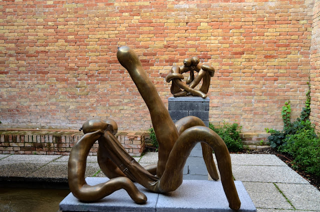
Sarah Luca's sculptures, which were rendered into bronzes were really interesting for me. They were put inside Carlo Scarpa's Sculpture Garden (at the Central Pavilion in the Giardini section), that gave me some kind of a positive energy. I think the artist is lucky about that, but of caurse her works had affected me more than the garden. Her sculptures turn into twisted and knotted bodies, which were sitting, kissing, etc like normal human-beings while they are not actually, they are more like bronze baloons or sausages, which was really interesting I think, because they had the power to make me feel what Luca tried to make us feel. For example with one of her sculptures, I felt its loneliness, sadness. She did some kind of a personification. At the same time their shiny and smooth bronze surfaces created really good contrast with the sharp lines of Scarpa's architectural design.


Marisa Merz
Marisa Merz
Marisa Merz


Eva Kotakova

Sarah Luca
Sarah Luca

Thursday, November 14, 2013

La Biennale di Venezia!


It was a really precious day for me... I have been in Venice to see the "Venice Biennale" I have always wanted to be in Venice, while there is the biennale. Luckily I was in Rome for Erasmus (still), so I went there only for one day, therefore I had to be really fast... I had the chance to visit Arsenale (Campo Tana) and Giardini.

I was primarily affected by the environment, because I was in one of the most beautiful and romantic cities of the world: Venice... So being in there, while surrounded by art made me feel like I was in a wonderful dream.


The 55th International Art Exhibition, that is curated by Massimiliano Gioni is open to public until 24 November 2013 at the Giardini, the Arsenale and in other different places around Venice. The title of the biennale is "The Encyclopedic Palace" with works spanning over the past century, while there are new commissions. Over 150 artists' from 37 different countries are included.

..."Massimiliano Gioni introduced the choice of theme evoking the Italio-American self-taught Marino Auriti who "on November 16, 1995 filed a design with the US Patent office depicting his Palazzo Eniclopedico, an imaginary museum that was meant to house all wordly knowledge, bringing together the greatest discoveries of the human race, from the wheel to the satellite. Auriti's plan was never carried out, of caurse, but the dream of universal, all-embracing knowledge crops up throughout history, as one that eccentrics like Auriti share with many other artists, writers, scientists, and prophets who have tried -often in vain- to fashion an image of the world that will capture its infinite variety and richness." (http://www.labiennale.org)"

The Biennale Arte 2013 will attempt "an inquiry in the realms of the imaginary and the functions of imagination. What room is left for internal images - for dreams, hallucination and visions - in an era besieged by external ones? And what iğs the pointof creating an image of the world when th eworld itself has become increasingly like an image? How far does the domainof the imaginary extend, when people are still fighting in the name of images?"... (http://www.myartguides.com/venice-art-biennale-2013/art-biennale/the-encyclopedic-palace/item/478-55-international-art-exhibition)

I have to add that there were pavilions for different countries, that were really enjoyable to see. I could not see all of them, but put photographs and informations about the ones that affected me.
Here are some photographs that I took from the Venice Biennale (from the Giardini), the works in pavilions I really like...


Ai Weiwei's installation for the French Paviilon

Every Chinese family typically have at least one stool that has several purposes, that passes through generation to generation. All of these stools, which have three legs have been manufactured in a uniform and used by all sectors of the society for centuries, but with the cuktural revolution, the production of these kind of objects started to stop. Apart from wood, materials like metal and plastic became standard. Ai Weiwei's work, called "Bang" is made with 886-three legged wooden stools made by traditional craftsmen. For the 2013 Venice Art Biennale, he wanted to do something that is not common to find. He put a lot of wooden stool which are all related to each other, that all have a massive look, "which is about the increasing volume of organisms in our world's megacities" We think that one stool symbolizes an individual, so the work show the individul's relationship with an immoderate system and other people in a postmodern world, that develops and changes really quickly.


The Pavilon of the United States of America by Sarah Sze

The work responds directly to the locations they have been commissioned for, transforming one's perspective of space and architecture through radical shifts in scale, occupying the often overlooked or peripheral areas of the adressed building with large-scale interventions. She included the exterior of the building to her work with a neoclassical approach in a different way, challenging the real order of palladian architectural style, that was normally modeled on Classical Roman arhitecture, in which symmetry an d proportions were important. The plan of the pavilion invites visitors into a rotunda (a building having a circular plan and a dome), through a central entrance. The artist closed off the main access and made the entrance at the left side of the building, aiming to make visitors travel through the structure in a logical way. Her target is to enwrite a very fragile personal order in a disordered univers by making calculated installations and putting objects which Sze found throughout Venice.


The Dutch Pavilion is very simple and fantastic for me. Works in the pavilion is made by Mark Manders. The pavilion showcases 'Room with Broken Sentence" curate dby Lorenzo Benedetti. There are Mander's installations made by various materials like clay, wood, etc, one of which is 4 meters high. He turns back to crazy consumerist dynamics of today and makes sculptures that seem to have always been there, that contains a mystery.The way he used the materials is like "nothing is what it seems. For example epoxy lookslike clay, clay looks like bronze, and bronze seems like wood, which enforces the mysteriousness.


Here is the work of Berlinde De Bruyckere that is exhibited in the pavilion of Belgium. The work that really affected me with its intensity. The name of her work is 'Kreupelhout - Cripplewood' a new and the only installation that is in the pavilion and "is inspired by the dialogue with the city of Venice, its history and the numerous paintings and sculptures of Saint Sebastian around the city. 'Kreupel - Cripplewood..."is the artist's plea for undisclosed beauty. 'Kreupel - Cripplewood' is a synthesis of themes that are the foundaiton of De Bruyckere's oevre: life and death; Eros and Thanatos; strenght and vulnerability, oppression and protection; desire and suffering; desolation and unification."..." this work is an enormous, gnarled and knotted, uprooted elm tree, merging into a mass of trunks and limbs with an almost disturbing resemblance to the muscles, tendones and bones of the human form. Between the tree's limbs, soft pillows, blankets and rags are used to soothe and support the exposed body. In 'Kreupelhout - Cripplewood', the metamorphosis form man to tree and vice versa, is tangible, but incomplite."... (http://www.smak.be/tentoonstelling.php?la=en&id=563)


The Russian pavilion by Vadim Zakharow

Here golden coins are raining down continuosly, through a hole, in to a 'cave womb' at the ground floor and only women visitors can get into the lower floors with an ubrella to protect them selves from the coin shower. 
The work has a mythological meaning: ..."Danae, according to Greek mythology, is the mother of the Greek hero Perseus; she was impregnated by the god Zeus, who appeared to her as a shower of golden rain."... (http://it.phaidon.com/agenda/art/articles/2013/june/03/venice-biennale-the-russian-pavilion/)

In the floor above a man in suitwatches the coin shower, while eating groundnuts, throwing the nutshells on the floor. On the walls in this room is written "Gentlemen, time has come to confess our Rudeness, Lust, Narcissism, Demagoguery, Falsehood, Banality, and Greed, Cynicism, Robbery, Speculation, Wastefulness, Gluttony, Seduction, Envy and Stupidity." The work actually refers also to the regime of Putin.


The Canadian pavilion by Shary Boyle, 'Music for Silence'

In her works ..."she blends historical narratives and fantastical fictions with her own personal impressions, she creates imaginary worlds that elicit a range of psychological and emotional responses."... (http://www.gallery.ca/venice/)

"The Canada pavilion will become a sanctuary where inner and outer space-co-exist." (Shary Boyle)


Wednesday, September 18, 2013

Italy from different Sights

Today I decided to share  more of my photographs that I have took last year in Italy, but in a different way. I edited my photographs to make the viewer see different sights with single captures of different places in Italy. I wanted my photographs to gain some kind of a dimension, and make them look  more vivid.

Dancing (Milan)

Don't Go Now (Venice)

Which Way? (Venice)

Cliché (Venice)


Friday, December 7, 2012

NABA Summer Course

I have mentioned before that I have been in Italy, for a summer program: Visual Designs. I know, it is no more summer, but for those who want to go for summer programs aboard, I want to share with you, what we have done, during 2 weeks, in Italy, Milano, in NABA (Nuova Accademia di Belle Arti).

We worked a lot with our hands and actually we did not use computer. We used movable fonts (types) for the typographic parts and used pressing machines. We made collages, and then photocopied them to make our works monochromatic and also to make 'mass production'.

It was interesting because, nowadays it is not easy to learn the old way of making visual designs, so we had the chance to learn the old techniques. Besides, it was enabled us to think more creatively.

Here are the photographs that I took during the courses in NABA:


NABA's garden 
Our teacher showed us her students work, that I really like.
The first class! We cut shapes out of colourful cartoons and formed faces.
We made sketches before doing our posters for a movie.
We learned there a lot about pop-up books.
We even learned how to make the simple ones.
While I was working my poster for 'Moulin Rouge'. 
The result after I rolled paint on the mould that I cut out with stencil.
I painted the typographic parts with a little sponge.
Moulds and the result.
This is how we rolled the paint, which was a special paint.
They took us to a wonderful book shop in Milan, called 123.

Different works of our teacher's other students.
My pop-up card inspired by Duomo of Milan. The first one before ' mass production'
My collage work. I copied it with the photocopy machine.
The engraving machines.


Movable types, that we used for the typographic parts.
Books that inspired us.

Selin, while working.

Our teacher Claude's and her students' works

The machine that we worked with. It wasn't easy!


I choose brown and orange.
Mass production, although they all have different details.


I wanted to make all of their cover in different colours, which are bright, in contrast with the inside.


You can see one of the moulds that I used.
Selin Sargut's work: Milan's people. Aren't they look adorable?

She have took all of the people's photographs from the class to make her work.
Anne, had done a really good job, too.


Bigg and his brilliant poster work for Milan.


We had fun:)